
Talk to people who live happily in a small space and you’ll notice a common thread: They take a whopping amount of pride in it. It’s not an ego thing. But there is a sense of achievement for those who can nest in less without feeling cheated.
These interior designers faced the ultimate small-space design challenge: their own homes. Every square inch counts when you can see your entire place from the front door.
Spoiler alert: If you wonder why your small space doesn’t quite look like theirs, walls were moved, ripped out, and rebuilt. Rooms were reimagined. Original floor plans had no sentimental value. Each homeowner invested serious time, money, or both to customize his or her pad. Don’t feel bad. Your walls can move, too.
The Boutique
Hotel Suite
By Dawn Stein Interior Design
THE APPROACH:
Visually expand the look of her space while adding the ease and luxury of a boutique hotel suite.
After studying design and film and pursuing a career in television, Dawn Stein is now a full-time designer. When she decided to relocate from L.A. to Palm Springs 10 years ago, she got cold feet about buying a house. A loft-style condo situated against the mountain caught her eye, a place she envisioned living large in a small space.
Stein spent the next year ripping everything out and starting over. “I fell madly in love with the view, but I wasn’t crazy about the interior,” she says. She wanted the space to reflect her lifestyle, from generous work space to a focal-point kitchen and built-in dining banquette for entertaining. “My ‘condo maximum’ is like a personalized boutique hotel,” she says. “I can come and go, no muss, no fuss.”
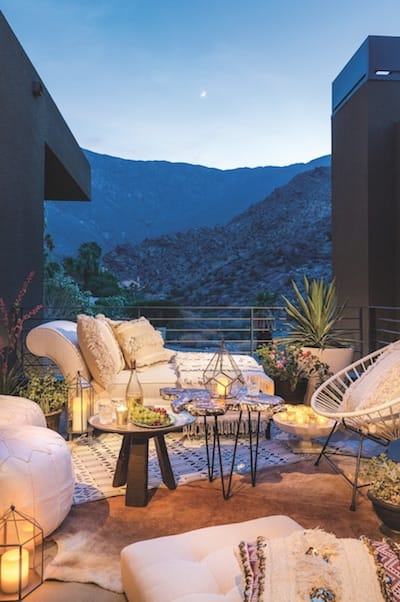
2: Tie the outside to the inside.
The deck upholds the neutral palette. Luxe accents worthy of a living room make it inviting. Varying heights among the elements keep the eye moving and makes the space feel larger. Moroccan accessories from Soukie Modern.
3: Sometimes bigger is better.
It’s an easy mistake: believing that everything in a small space has to be small. Enter: the large sectional couch. “Everyone is super comfortable on it when they come over,” Stein says. An oversized ottoman doubles as a coffee table.


4: Wall-mounted love.
“Floating brings the eye up,” Stein notes. She employed floating shelves, a floating entry drawer, and this floating bar to make narrow spaces appear wider.

5: Showcase your collections.
“You have to edit yourself, your stuff, and your style,” while displaying only what you love most, Stein says. Choice vignettes of art and vintage accessories keep her accents focused. “I didn’t want to come home to a pandemonium of clutter.”
The Happy
Vacation Home
By Mr. Mann’s Design
THE APPROACH:
Continue the vacation spirit throughout this midcentury home that has its own private path to the community pool.
The most distinctive trait of Park Imperial South condos is the folded plate roofline, with an impact both inside and out. Some observers note that the accordion-style lines — designed by a 25-year-old Barry Berkus, AIA, in 1961 — mimic the mountains.

1: Work with the yellow, not against it.
The designers chose one palette and extended it outside to optimize flow. Formica discontinued the original yellow sparkle; updated kitchen counters feature an anniversary edition called Citrus Halftone. The bedrooms wear new yellow shag carpet; the master bath still gleams with the original yellow sparkle Formica.
Craig Mann and Ossie Saguil purchased the condo to serve as a rental and designed it for vacation living. Storage took a backseat to open space, effortless flow, and a cheerful palette that would jump out and grab potential renters as they sift through online listings. “The most common feedback is nonverbal,” says Saguil. “Everyone breaks out in a broad smiley face, like the yellow emojis. One guest described it as a young, graceful Doris Day in a 1957 Chevy Bel Air, turbo-sized for the millennium, exuberantly optimistic for the future.”


2: Design the outdoors as another room.
The long, awkward patio is now a fairway-style oasis. A new two-hole putting green adjoins a seating area reminiscent of a sand trap. Built-in L-shaped planters provide party seating, coupled with a table and mismatched chairs.
3: Closets can go.
It’s surprising that small spaces often benefit from reworking the closets. To open up the TV room, the designers removed two coat closets. The new pass-through niches bring natural light into an otherwise dark hallway. Inside, vintage bamboo étagères with spot lighting house favorite pieces from their collection.


4: Open the kitchen.
It’s the cardinal rule of any HGTV show, and most small spaces. The small original kitchen joined an impractical enclosed patio, separated by the kitchen counter. The pair re-invented the counter as an island for breakfast, drinks, prep work, or MacBook time. They opened the space while preserving original features like the globe light fixtures. New Northstar appliances pop in robin’s egg blue.
The WHITE box
FOR a MODERN
MINIMALIST
By remodeler Jay Longtin
THE APPROACH:
Create a bright, open space with great energy that feels alive and organic. Plenty of storage options are a must.
Jay Longtin’s remodeling talents span commercial and residential projects. See his touch at Bootlegger Tiki, Ernest Coffee, the kitchens at The Amado, the new Draughtsman, and Wexler Steel House No. 4. Longtin bought, gutted, raised the ceiling, and reconfigured the layout of his 1971 townhouse at the nondescript Indian Canyon Gardens, tackling 90 percent of the work himself.

1: Give each item a home — and keep it there.
Organization rules a small space. In the kitchen, a custom built-in pantry hides a microwave and other essentials. The island offers additional storage on both sides. Clutter-free quartz countertops jazz up basic IKEA cabinets. Longtin saw the peel-and-stick reclaimed Stikwood at Dwell on Design last year. Where used as a backsplash, he coated it with high-gloss polyurethane to make it waterproof.
His spatial aptitude yielded a music studio, guest room, office, open show kitchen, and large spa bathroom that borrowed square footage from the master closet. Its minimal aesthetic stems from Longtin’s tenet: everything in its place. A mix of custom and affordable furnishings from West Elm, CB2, and Article make it home.


2: Trust your gut.
Longtin bought the home for the stairs, envisioning rope instead of railings — although few friends liked his idea. Four-hundred feet of continuous black rope later, it’s the feature that gets the most compliments.
3: When in doubt, white works.
Brightness begins with white ceilings and walls. Longtin’s floor is a concrete overlay with a white epoxy finish. “I had to get used to them getting dirty,” he says. “It has a lived-in look.”

4: Let there be life.
“I’m obsessed with plants. They bring life to the space,” says Longtin, who plants them in most rooms. Beneath the glass landing of his staircase, a custom planter makes an abridged nod to midcentury atriums.