
“Sometimes a vintage modern sofa is not really comfortable,” says Vance Burke of Vance Burke Design Inc.
His clients for a recent project agree. After strolling through Burke’s own home on a Seven Lakes tour during Modernism Week, they reached out.
Burke’s co-collaborator, Todd Peter, says their clients gravitated toward modern interiors, but with reservations. They had always found them to be uncomfortable. “Vance’s home has a softness and a comfort level that resonated.”

photo by henry connell
In the living room, Heart Above Head, 2004, by Tim Bavington. Above the dining banquette, Taurus, 2009, by Sarah Morris. The shape of the artwork mirrors the clerestory window above it. The egg lamp is vintage Murano.
Splitting the rest of their time between a Dallas high-rise and a summer lake house in Michigan, the clients, who wish to be anonymous, wanted an interior that complemented Seven Lakes’ 1960s architecture by Richard Harrison for their third home. The mission: a comfortable and contemporary desert retreat that referenced the midcentury era in a modern context. The home’s two-bedroom-plus-den layout made it the ideal size for a cozy vacation home with a modern aesthetic.
Although Burke and the owners are neighbors, their conversations occurred almost exclusively over email. “We totally trusted Vance and Todd with the design including all custom cabinetry throughout the home,” says one of the homeowners. Keys in hand, Burke and Peter created a total environment, from decorative vases to the bedroom sheets.
above photo by david blank/bottom photo by henry connell
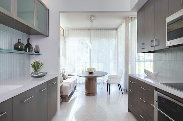
The long kitchen serves the purpose of a bar when hosting friends for pre-dinner cocktails. (Below) A vibrant vignette in the master dressing room features Mayoyoque, 2010, by Omar Chacon and a Venini acid green art glass bowl.
“It’s like telling a story from the ground up,” says Burke of the team’s “skyline” approach to each room. They start with the floors, move up to the upholstery, tabletops, and artwork, then finish with unpredictable yet appropriate lighting choices. Each level requires testing the result from every angle.
 While the pair collaborates on the overall design, Peter concentrates on selecting current works of art and sourcing vintage pieces. Few design firms possess an in-house art expert who devotes such time and effort to what will hang on the walls. In this home, the works Peter chose by California artists appealed to the homeowners’ California ideal. “The artwork over the living room sofa and over the bed in the master bedroom turned out to be two of our favorite aspects of the entire home,” one relates.
Burke affirms that the contemporary art collection Peter created for the clients adds visual drama throughout. “His selections are not necessarily the safe choice,” he says. “Each has a lot of personality and gives the rooms punctuation.”
“Originally, the owners really didn’t want any color,” Peter shares. Their early vision of a simple black-and-white motif gave way to the designers’ call for a bold color accent in each room. One piece, often the artwork, dictated the direction. With the clients’ fast approval of an attention-grabbing striped painting and a pair of lemon-yellow chairs, the scheme fell into place. “I had initially thought color would be added through the use of smaller accents, but I wanted Vance and Todd to ‘do their thing,’” one owner says. “I had never envisioned yellow chairs in the den, but we love the end result.”
Burke offset the clients’ hesitation to adopt a broad color palette with their appreciation for pattern and texture. Grasscloth walls, geometric tiles, and a pair of heavily textured Japanese vases wired as lamps are part of a mix that fills the home with quiet excitement. Where color wanes, the designers mixed finishes. White comes in “shades” of porcelain, lacquer, and marble. Across the living room wall, rugged chiseled limestone contrasts with the floor’s shiny terrazzo.
photo by henry connell
A Bertoia Diamond Chair adds vintage flair to the courtyard entry. Center: The long kitchen serves the purpose of a bar when hosting friends for pre- dinner cocktails.
The designers’ keen eye for balance adds another layer of comfort and cohesion. Their careful infusions of color and texture blend with sculptural forms, geometric patterns, and masculine, modern shapes that retain a classic allure. New and custom furnishings mix with Peter’s vintage finds. This yin-yang plays out best with one Italian totem in the den and a second one outdoors, seen through the glass.
A consistent use of materials was the finishing touch to their balancing act. Custom upholstery features the same fabric in multiple rooms but in different styles and channeling. Custom cabinets serve clients’ needs in a wire-brushed white rift oak with a driftwood finish, from the master bedroom and dressing area to the kitchen. There, the cabinets recede as a supporting cast member to the star of the space: a 15-foot cantilevered glass shelf that spans the length of the kitchen.
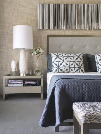
photo by david blank
Above the bed, the muted palette of SILENCEISGOLDEN, 2009, by Marcus Linnenbrink works well with a Japanese vase wired as a lamp on a custom, silver-leafed base.
“They told us they didn’t cook,” Peter explains. “People come over, they make drinks, and then go out to dinner.” This feat of engineering cleverly transforms the long kitchen into what looks like a bar.
The outdoor courtyard received equal treatment as another room. “We love that they incorporated it into the floor plan with the use of sliding glass doors,” one homeowner says. “It’s great for entertaining family and friends and especially nice for our dog, Buddy.”
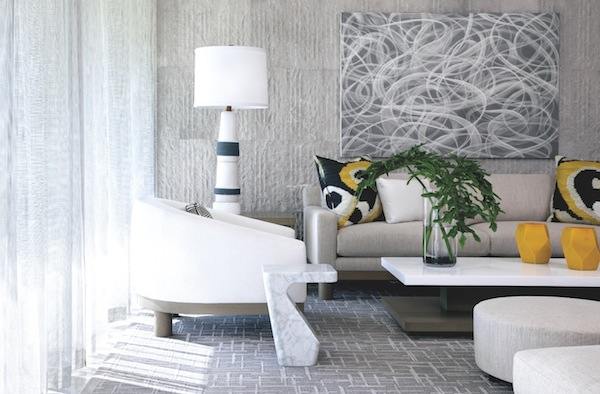
photo by david blank
Against the living room’s limestone wall, a marble Pierre Charpin cocktail table and early 1960s Martz glazed ceramic lamp complement the contemporary artwork Plymouth, 2014, by Mark Sheinkman. An Ikat pillow introduces a splash of yellow.
Burke remembers the owners’ arrival as his favorite moment. “With the addition of color throughout the home and a great selection of art pieces, Vance and Todd did an outstanding job of giving us classic, midcentury modern pieces in a contemporary setting,” one client relates. “We were so pleased that comfort was not sacrificed.” Burke firmly believes that color is actually part of the comfort.
“What we try not to do is an all-white house,” he says. “I think that’s harder to live in. It feels more like a showroom or a restaurant. It also feels dated. I think people want a warmer, more inviting design to live in.”
Peter agrees that a few vibrant hues helped pull it together. “For guys who initially didn’t want color, they were really adventurous with the artwork,” he says. “They really stepped it up and had fun with it.”